Be God — Roblox UI/UX Case Study
UI/UX design for an original Roblox game — from audit to shipped, validated on desktop and mobile.
problem
Be God is a live Roblox god-sim, but its interface was built from placeholder UI that got in the way of the mechanics it was meant to communicate. Cooldown timers on the god powers were hard to see, leaving players unsure whether a power was recharging or simply broken. Selected and disabled states were ambiguous — the same visual treatment could read as either. And multiple UI elements competed for the same regions of the screen, creating clutter that lowered legibility and made the game's systems harder to understand.
solution
I reworked the interface around visual hierarchy and clearer, more intuitive states — like lowered opacity for unselected powers — to reduce cognitive load and friction, so players can read the game's systems at a glance and focus on playing.
Reading the core HUD
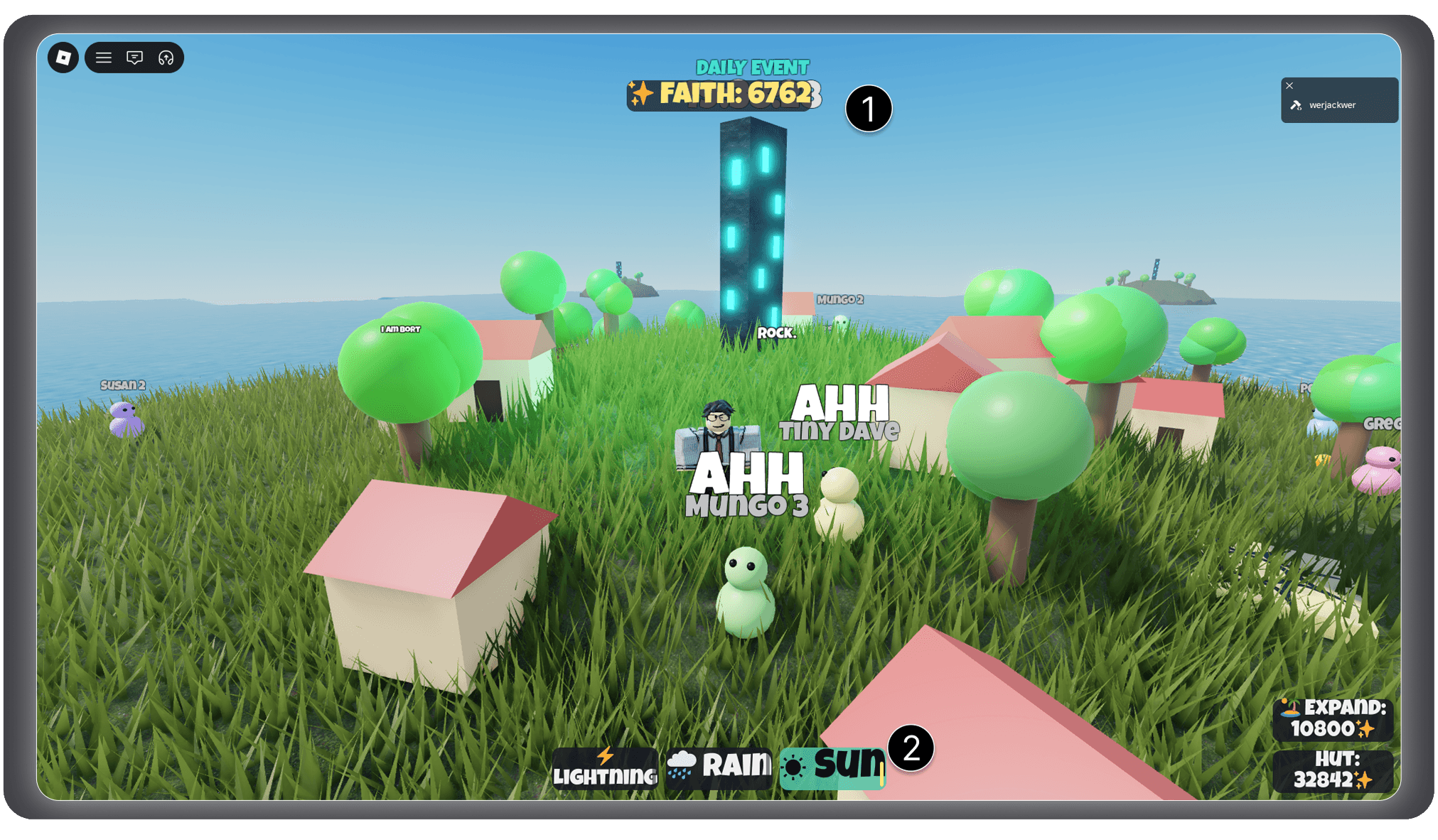
① Faith counter. The counter sat at top-center, where it could obscure the daily event timer, and large values overflowed their container. I moved it into the corner clear of the timer and abbreviated large numbers (404.2K, 1.8M), so the display scales with the economy rather than the economy shrinking to fit the display. (Visibility of system status.)
② Power button states and cooldowns. The original selected state turned the button teal with black text — ambiguous, since that could read as "selected" or "unavailable." I separated the two states by opacity instead: unselected powers sit translucent, the selected power goes full opacity with a white border. Opacity maps intuitively to active-vs-inactive, removing the ambiguity. I also renamed "Lightning" to "ZAP" so the label fit cleanly inside the button. The cooldown bars had a related problem — they overlapped the button text, competing for the same space. I replaced them by draining the entire button container as the power recharges, so the whole button becomes the cooldown indicator, making the state impossible to miss without ever obscuring the label. (Visibility of system status; consistency and standards.)
Boss-fight feedback
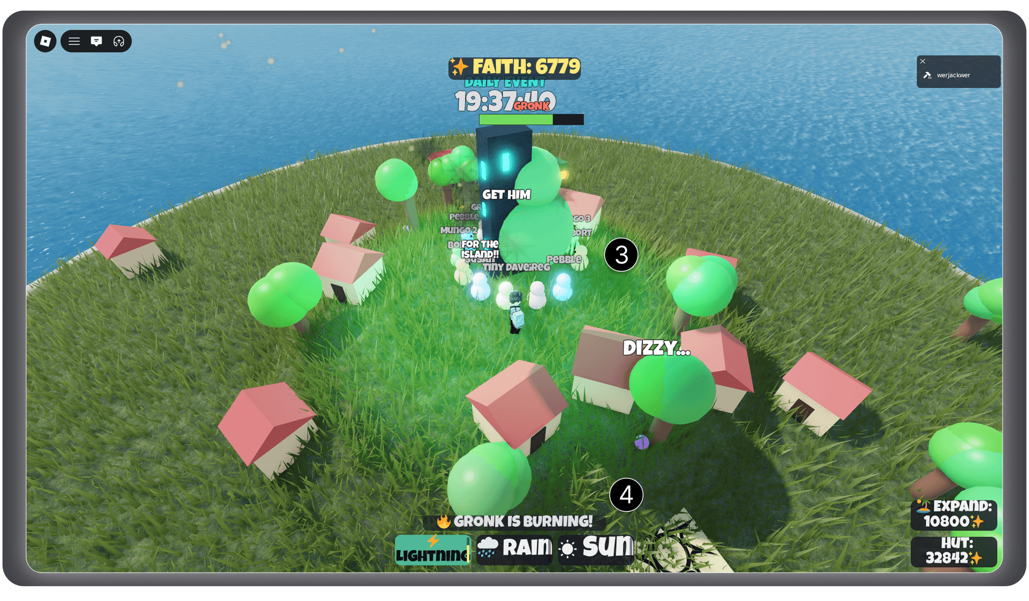
③ Screen clutter. Villager nametags and idle chatter filled the screen during the fight, burying the information players actually needed. I suppressed nametags and idle lines for the duration of the fight, clearing the field so combat feedback could own the screen. (Aesthetic and minimalist design.)
④ Status feedback. Status conditions were shown by a small popup above the power buttons — but during a chaotic boss fight, players' eyes are on Gronk, not a HUD corner, so it went unnoticed. I moved the feedback into the world instead: intense flames engulf Gronk when he's burning, his eyes change to show blindness, and one villager shouts the status in large red text as it lands. Delivering the same information through both an effect and a callout removes any ambiguity between a "fire-mode" power state and an actual burning condition — and puts the feedback where the player is already looking. Clearing the nametags first is what let the callout land. (Visibility of system status.)
Mobile layout
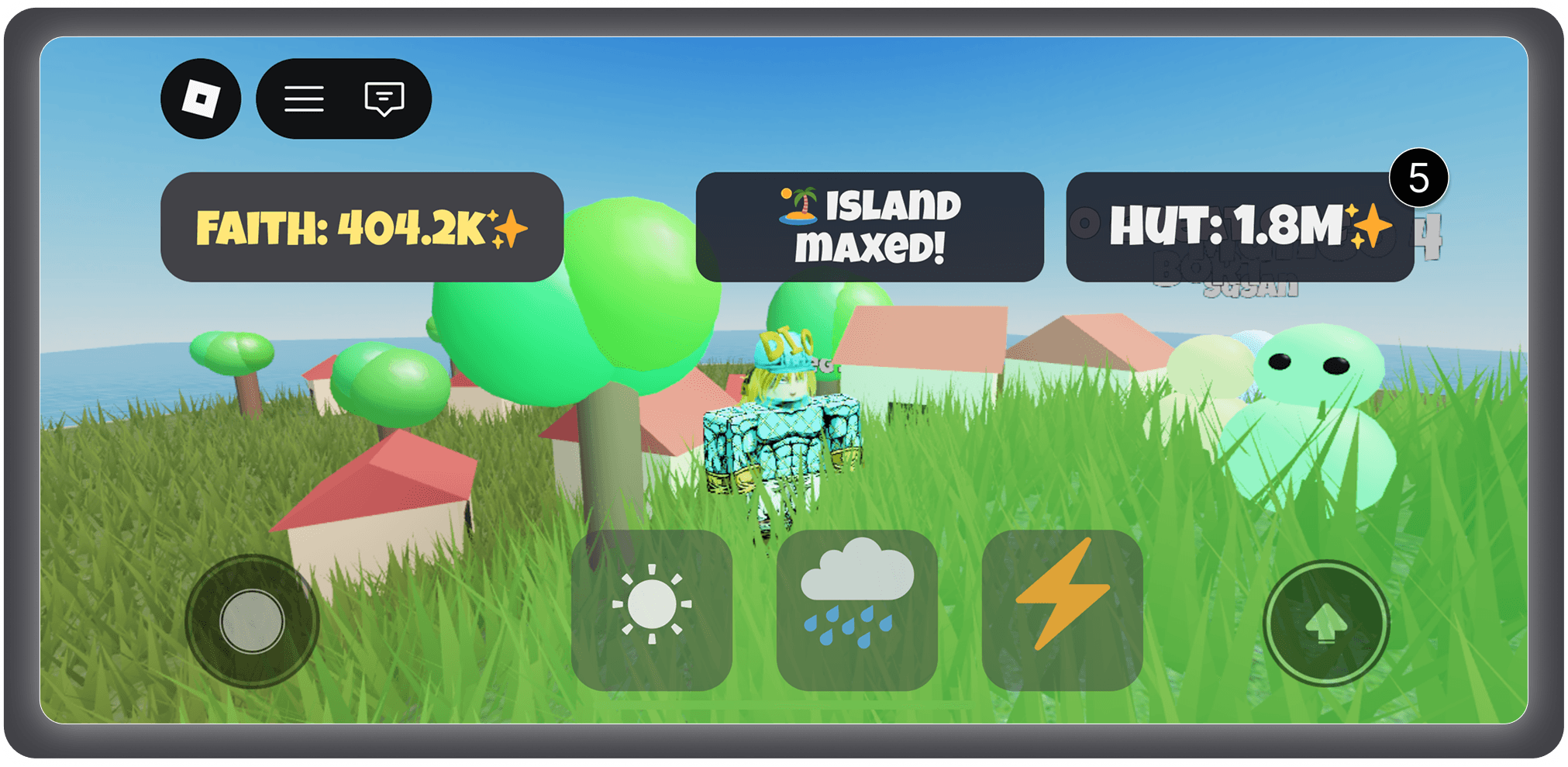
⑤ The desktop layout didn't survive a phone viewport — power buttons ran off the screen edges, counters overlapped, and controls covered the joystick and jump button. I began designing in portrait, but shifted to a forced landscape orientation once I recognized that a game built around reading your village's layout needs the horizontal space — a deliberate tradeoff of one-handed convenience for legibility. I scaled the UI down and dropped the text labels from the power buttons, since the icons stayed intuitive on their own. I moved the powers from center to the bottom-right, aligning them with the natural arc of the thumb for how a player actually holds the device. I also caught an input bug in the process: touches were firing powers on touch-start, so panning the camera cast spells by accident — I reworked it to only cast on a deliberate tap.
Final desktop HUD
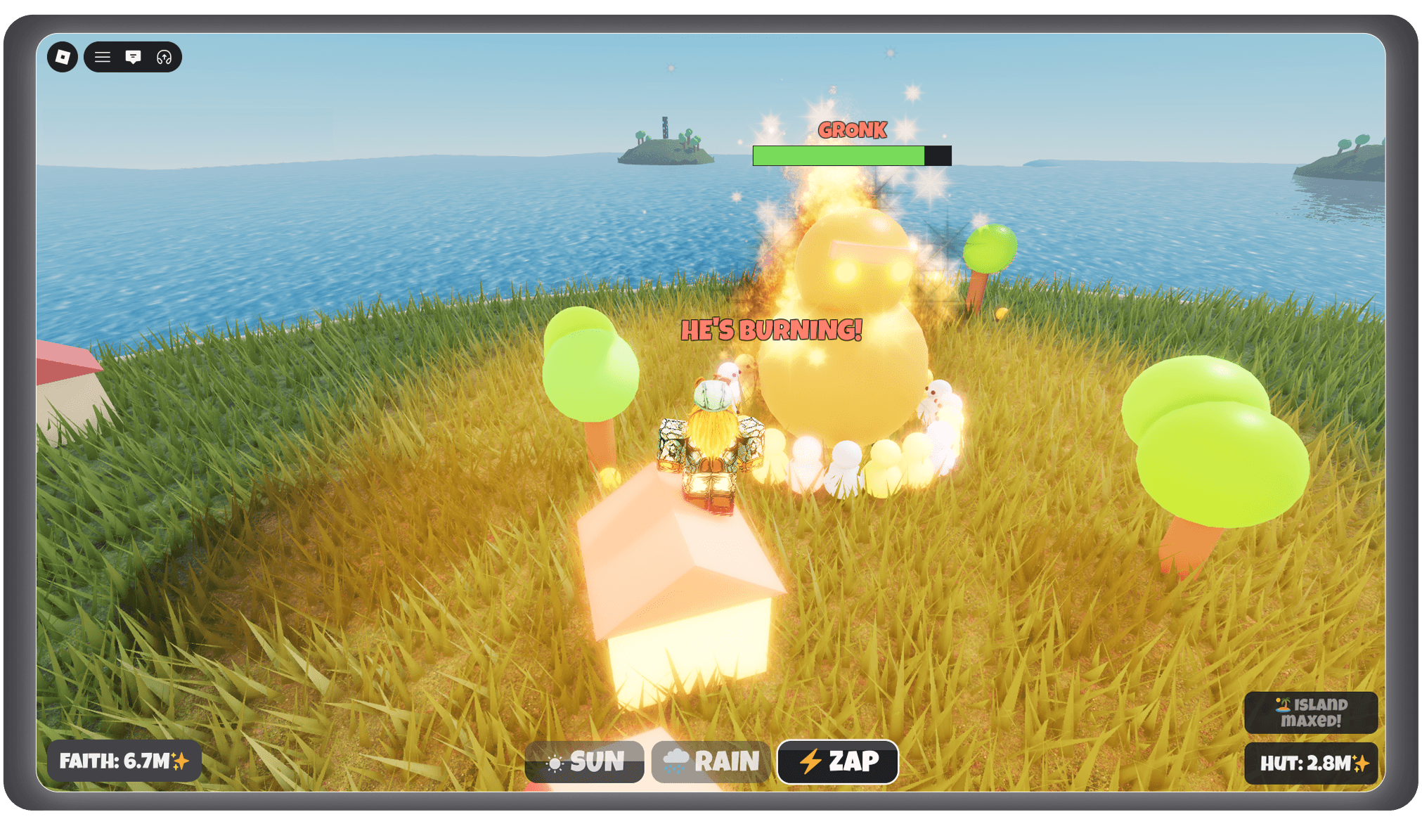
The finished desktop HUD: counters cleared to the corners, power states readable at a glance, and boss feedback delivered in the world rather than the interface.
Final mobile HUD
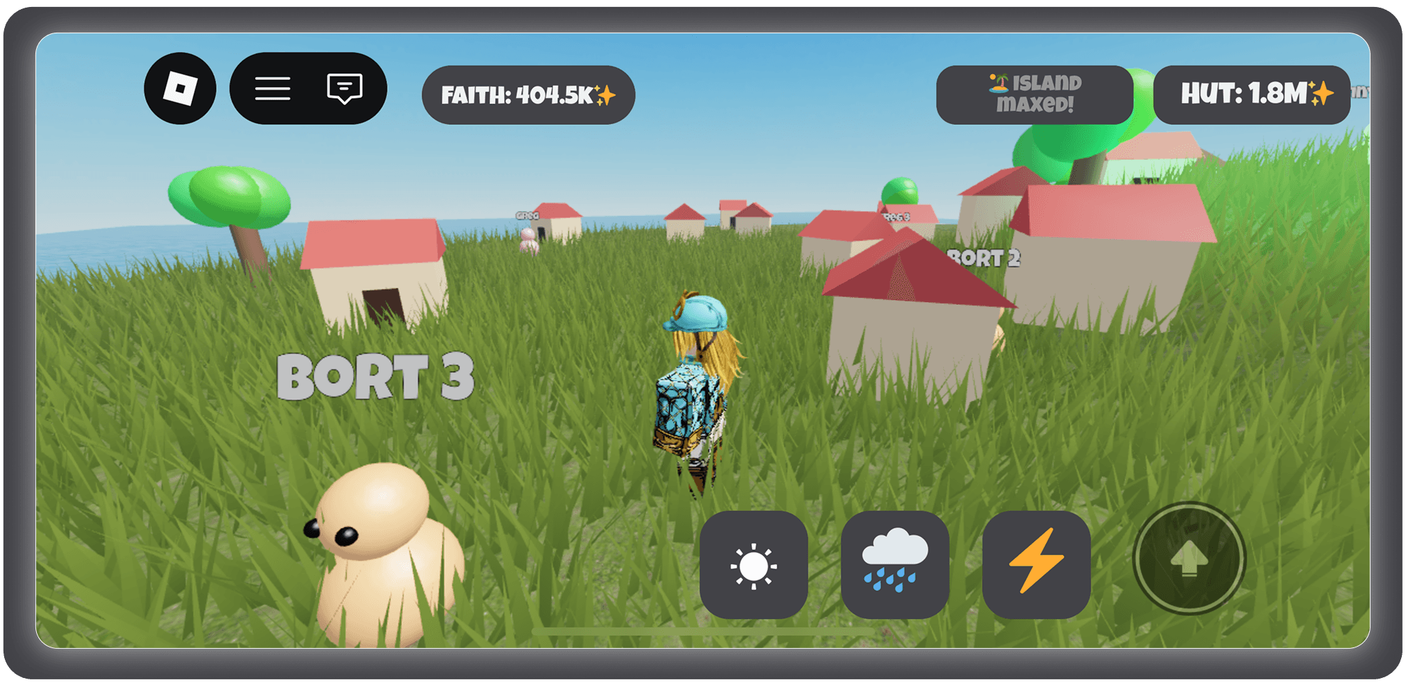
The finished mobile layout: forced landscape, icon-only powers grouped within thumb reach, and every control clear of the joystick and jump button.
year
2026
timeframe
4 weeks
tools
Roblox Studio, Figma
category
UI/UX